



4.6 Simulation Scaling and Smoothing
Simulation Scaling and Smoothing in the API
Since we'll be plotting multiple figures in this section, let's define a color dictionary so that we can reuse colors without needing to manually specify the hexicecimal code every time we plot something. We'll try to use colors that mimic what is used in the HNN GUI video (above), though note that the GUI is more restrictive than the API and so there will be some discrepancies.
                        gui_colors = {
    "orange": "#ff7f0e",
    "blue": "#1f77b4",
}
In the previous section, we ended with a plot of the raw simulated dipole and the loaded experimental dipole, which were different in both their shapes and magnitudes.
These discrepancies are related to Step 3 of our experimental workflow:
- Adjust the scaling (and smoothing) of your simulated dipole signal
With HNN, we simulate a network comprised of two 10 x 10 grids of pyramidal neurons, in two distinct cortical layers, for a total of 200 pyramidal neurons that contribute directly to the simulated dipole signal. (There are also 35 interneurons per layer, but these do not contribute directly to the dipole signal.)
The human cortex, however, contains many more pyramidal neurons than in our reduced network, and source-localized MEG signals typically represent the synchronous activity of tens of thousands of pyramidal neurons.
Rather than explicitly simulate thousands of neurons, we can leverage the fact that the neocortex has a highly stereotyped, canonical circuit architecture. As such, the activity generated by a relatively small cortical column can be viewed as representative of the synchronous activity in a larger patch of cortex, and it is precisely this synchronous activity that we observe in our source-localized, experimental ERP data.
In the model, we represent this synchrony by multiplying our simulated dipole signal by a uniform scaling factor, which effectively captures the synchronous activity of a larger population of similarly-active neurons
We do this in hnn-core by using the
.scale() method of the Dipole object.
Remember that the simulate_dipole() function returns a
list of dipole objects, one for each trial. We need to first select an
individual trial to apply the dipole scaling factor.
                        # get the first (in this case, only) trial from the
# list of dipole objects
dipole_01 = dipoles_list[0]
Keep in mind that the scaling factor is applies to the object in place (in otherwords, the new dipole with the scaling applied will "overwrite" the raw, unscaled dipole)
Let's make a copy of the dipole object before we apply the scaling factor so we can plot both dipoles
                        # we use copy() to ensure we have a new copy of the dipole
# that is seprate from the original
dipole_01_scaled = dipole_01.copy()

# set scaling factor and apply it to the copy only
scaling_factor = 3000
dipole_01_scaled.scale(scaling_factor);
Note that we multiply the simulated dipole by a uniform scaling factor at each time point such that we are not altering the underlying shape of the signal, only the magnitude of the peaks and troughs. This ensure we are not overfitting to the experimental data, as fitting the scaling factor to any one peak necessarily changes the value every other time point.
We can see that this is the case when plotting the unscaled and scaled dipoles side by side. Note that the y axes (highlighted in red) are different, but the underlying waveform shapes (relative peaks and troughs) remain the same
                        # plot the dipoles side by side
# --------------------------------------------------
fig, axes = plt.subplots(
    nrows=1,
    ncols=2,
    figsize=(10, 5),
    constrained_layout=True,
)

_ = dipole_01.plot(
    ax=axes[0],
    show=False,
)
axes[0].lines[0].set_label("Unscaled Simulation Dipole")

_ = dipole_01_scaled.plot(
    ax=axes[1],
    show=False,
)
axes[1].lines[0].set_label("Scaled Simulation Dipole")

# style subplots
# --------------------------------------------------
for subplot in axes:
    # highlight y axes in red
    subplot.spines["left"].set_color("red")
    subplot.tick_params(
        axis="y",
        colors="red",
    )

    # change line colors
    subplot.lines[0].set_color(gui_colors["blue"])

    # show legends
    subplot.legend()

We can add the experimental data to these plots to compare the order of magnitude and see if our scaling factor was appropriate
                        # conditionally add experimental data to our figure
# --------------------------------------------------
for subplot in axes:
    # if there's only one line on the plot, we still
    # need to add the experimental data
    if len(subplot.lines) == 1:
        # add experimental data
        _ = threshold_experimental_dpl.plot(ax=subplot, color="black")

        # change presentation
        subplot.lines[1].set_color(gui_colors["orange"])
        subplot.lines[1].set_label("Experimental data")
        subplot.legend()

# force y axes to be equal and reset their colors
# --------------------------------------------------
ymin = min(ax.get_ylim()[0] for ax in axes)
ymax = max(ax.get_ylim()[1] for ax in axes)

for subplot in axes:
    # apply the ymin and ymax
    subplot.set_ylim(ymin=ymin, ymax=ymax)

    # reset axis color
    subplot.spines["left"].set_color("black")
    subplot.tick_params(axis="y", colors="black")

fig
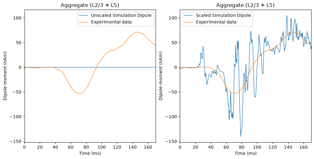
While the scaled simulation dipole is much closer to the order of magnitude of the experimental dipole, the signals themselves still differ substantially in their waveform shapes.
This is because source-localized signals reflect the aggregate activity of a very large population of neurons. When a large number of neurons contribute synchronously to the measured signal, small differences in their individual spike timing tend to be averaged out, producing a "smoother" dipole signal than we obtain from our smaller simulated network.
To approximate this effect, we can use the .smooth()
method of the Dipole object, which applies a
Hamming-windowed convolution to the simulated dipole. The width of this
convolution window is specified in milliseconds, allowing you to control
the amount of smoothing applied to the signal.
Note that the .smooth() method also updates the dipole
in place, so we will first make a copy of the object before the
transformation. Below, we will plot updated dipoles using two different
window widths for comparison.
                        fig, ax = plt.subplots(
    figsize=(8, 6),
    constrained_layout=True,
)

# plot scaled dipole with 15ms window
# --------------------------------------------------
dipole_15ms = dipole_01_scaled.copy().smooth(15)

_ = plot_dipole(
    dipole_15ms,
    ax=ax,
    show=False,
)

# pro tip: "[-1]" here targets the newly-added line
ax.lines[-1].set_color(gui_colors["blue"])
ax.lines[-1].set_alpha(0.4)  # reduce the opacity to 40%
ax.lines[-1].set_label("Scaled simulation: 15ms smoothing")

# plot scaled dipole with 30ms window
# --------------------------------------------------
dipole_30ms = dipole_01_scaled.copy().smooth(30)

_ = plot_dipole(
    dipole_30ms,
    ax=ax,
    show=False,
)

ax.lines[-1].set_color(gui_colors["blue"])
ax.lines[-1].set_label("Scaled simulation: 30ms smoothing")

# plot experimental data
# --------------------------------------------------
_ = threshold_experimental_dpl.plot(
    ax=ax,
    show=False,
)

ax.lines[-1].set_label("Experimental data")
ax.lines[-1].set_color(gui_colors["orange"])

plt.legend()
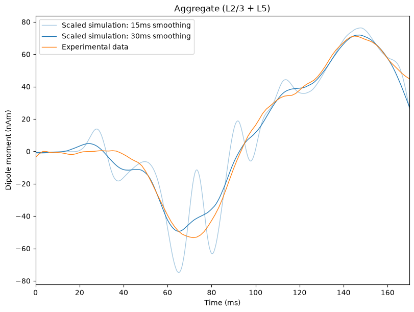
We can see that the fit is considerably improved after applying the smoothing to the simulation.
Lastly, it is important to note that the scaling factor also gives us an estimate of the number of synchronous neurons that contributed to our experimental dipole signal.
For example, if the M70 peak in our our experimental data is approximately -60 nAm, and the raw simulated dipole signal is approximately -0.02 nAm, then we would need to multiply the simulated dipole by 3,000 to bring the signals into the same order of magnitude. In this case, we would estimate that approximately 3,000 x 200 = 600,000 pyramidal neurons are contributing to the signal in the experimental data.
While we've found that a scaling factor of 3,000 and a smoothing window of 30 work well for the experimental MEG data in (Jones et al. 2007), there is no guarantee that these will be appropriate for your experimental data. In fact, it is very likely that you will need to try different scaling factors and smoothing windows to bring your simulation and your data into the same order of magnitude.