



4.10 From Hypotheses to Validation Targets
From Hypotheses to Validation Targets
In the previous section, we set up a hypothetical example in which the default simulation represented a neurotypical population performing the threshold-level tactile-detection task, while the experimental data represented an ASD population with sensory hypersensitivity performing the same task.
We then proposed two hypotheses for the observed differences in the dipole signals: 1. Increased amplification of sensory inputs via stronger local excitatory connections 2. Reduced inhibitory regulation of pyramidal neurons
After testing both hypotheses, we concluded that the simulation with stronger excitatory "E-E" and "E-I" connections yielded the more promising fit to the experimental data, suggesting that increased excitatory recruitment in the local network could contribute to some of the observed differences in the dipole signals.
However, it's important to emphasize that the aggregate dipole alone does not give us the full picture of what's happening in the model. We can't tell from our initial dipole plot why the fit improved, or whether the underlying activity is biologically plausible.
To develop more specific predictions about the mechanisms underlying the observed differences, we can examine the underlying cell and circuit activity in the model.
There are many ways to investigate the underlying activity, such as
observing the layer-specific dipoles, spiking activity, or local field
potentials. We encourage you to explore
Section 7: Using the API, which contains advanced tutorials
covering several API-specific features, such as recording extracellular
potentials.
In the current section, we'll compare spike raster plots to explore
how the simulation outputs can be used to identify targets for
experimental validation. This is meant to be an illustrative example,
not a comprehensive one, and is functionally similar to the more
comprehensive analysis exercise we covered in
Section 4.7: Multiscale Interpretation.
Before diving into the interpretation exercise, let's briefly refresh on how simulation output data are represented in HNN.
As a reminder, the simulated dipole data are stored
separately from the network and are returned by the
simulate_dipole() function. Other simulation data, such as
the celltype-specific spiking, are stored with the network in
the CellResponse attribute.
Let's examine the public attributes of CellResponse
                        # initialize empty list to store attributes
public_attributes = []

for attribute in dir(net_default_gui.cell_response):
    # ignore private attributes (those that start with "_")
    if not attribute.startswith("_"):
        public_attributes.append(attribute)

# print the public attribues
print(public_attributes)
Note that the CellResponse object has various attributes related to
spiking data. We've already made use of the methods
plot_spikes_hist and plot_spikes_raster.
Should you need to access the underlying data for your own analysis, the
raw spike data are available under the spike_times,
spike_gids, spike_types, and
spike_times_by_type data attributes.
There are also additional output data stored with the
CellResponse object. For example, the isec and
ca data attributes contain the (optionally-recorded)
synaptic currents and calcium concentration, respectively.
In previous sections, we defined custom functions that call
plot_spikes_hist() and plot_spikes_raster()
with pre-specified arguments. For the analysis below, we'll reuse these
functions to create a new figure that shows: 1. The input histogram
(which is identical for the two simulations) 2. The spike raster for the
default simulation, and 3. The spike raster for our updated
simulation (testing the "local amplification" hypothesis)
Since we made a copy of net_02 after changing parameters
to test the increased amplification hypothesis, we already have the
CellResponse data we need to create our new figure.
                        # get the unsmoothed dipole for the updated simulation
scaled_dipole_02_01 = net_02_dpl_01[0].scale(3000)

fig, axes = plt.subplots(
    nrows=3,
    ncols=1,
    figsize=(10, 10),
    gridspec_kw={"height_ratios": [1, 3, 3]},
    constrained_layout=True,
)

# plot the input histogram in the top subplot
custom_drive_hist(
    ax=axes[0],
    net=net_default,
)
# plot the spike rasters in the bottom subplots
custom_spikes_raster(
    ax=axes[1],
    net=net_default_gui,
    processed_dipole=unsmoothed_dipole,
)
axes[1].set_title("Default Simulation")

custom_spikes_raster(
    ax=axes[2],
    net=net_02_checkpoint_01,
    processed_dipole=scaled_dipole_02_01,
)
axes[2].set_title('Local Amplification ("E-E"x2 and "E-I"x2)');
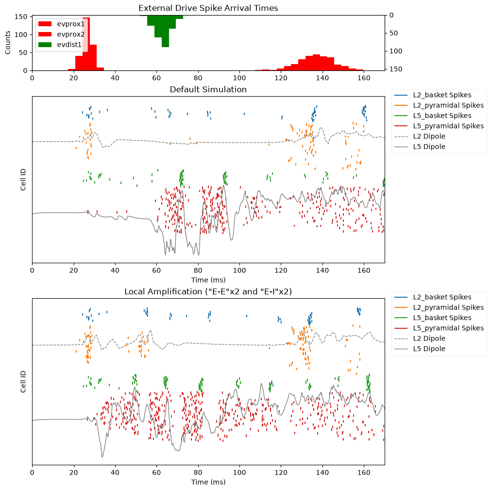
We can see in the figure above that the two simulations have several differences in their underlying spiking activity. For the purpose of this exercise, let's identify three differences in the spiking activity in Layer 5 between the two simulations:
Around the time of the first proximal drive, there appears to be greater recruitment of pyramidal neurons in the "local amplification" simulation compared to the default simulation.
The timing of pyramidal neuron and interneuron spiking appears to be shifted earlier in the "local amplification" simulation.
There appears to be stronger, more synchronous interneuron spiking in the "local amplification" simulation around the second proximal drive.
These observed differences highlight specific features of the circuit activity that we can investigate further. In particular, they give us predictions about which cell populations may be more strongly recruited, and how the timing of the activity may differ, between the neurotypical population (represented by the default simulation) and the ASD population (represented by the "local amplification" simulation).
We can then use these observations to identify targets for validation in follow-up experiments. For example, we could look for increased recruitment of pyramidal neurons during the early sensory response, or investigate whether the latency of the Layer 5 response differs for the ASD population. We could also examine whether inhibitory neurons show stronger or more synchronous activity during the corresponding response.
These are just a few examples of how model simulations can guide experimental validation. Rather than only comparing the aggregate dipoles between the model and the data, we can use the differences in underlying circuit activity to develop more specific predictions that can be tested with imaging, in vivo recordings, or other experimental modalities.