hnn_core.viz.plot_cell_connectivity#
- hnn_core.viz.plot_cell_connectivity(net, conn_idx, src_gid=None, axes=None, colorbar=True, colormap='viridis', show=True)[source]#
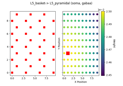
Plot synaptic weight of connections.
This is an interactive plot with source cells shown in the left subplot and connectivity from a source cell to all the target cells in the right subplot. Click on the cells in the left subplot to explore how the connectivity pattern changes for different source cells.
- Parameters:
- netInstance of Network object
The Network object
- conn_idxint
Index of connection to be visualized from net.connectivity
- src_gidint | None
The cell ID of the source cell. It must be an element of net.connectivity[conn_idx][‘gid_pairs’].keys() If None, the first cell from the list of valid src_gids is selected.
- axesinstance of Axes3D
Matplotlib 3D axis
- colormapstr
The name of a matplotlib colormap. Default: ‘viridis’
- colorbarbool
If True (default), adjust figure to include colorbar.
- showbool
If True, show the plot
- Returns:
- figinstance of matplotlib Figure
The matplotlib figure handle.
Notes
Target cells will be determined by the connections in net.connectivity[conn_idx]. If the target cell is not connected to the source cell, it will appear as a smaller black cross. Source cell is plotted as a red square. Source cell will not be plotted if the connection corresponds to a drive, ex: poisson, bursty, etc.